
Case study
Empower YOUth
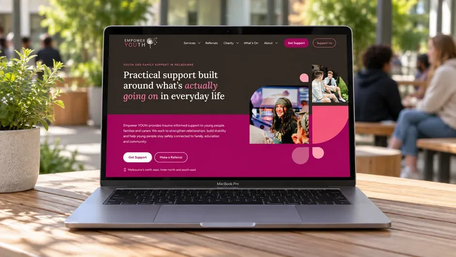
Making a complex support organisation easier to understand, and its website easier to run.
Empower YOUth provides NDIS services and runs a registered charity supporting young people, families and carers across Melbourne.
We reorganised its services, referrals, charity work and programmes around the people using the site, then built it so the team can keep it current themselves.
01
Translating a complex organisation into plain language
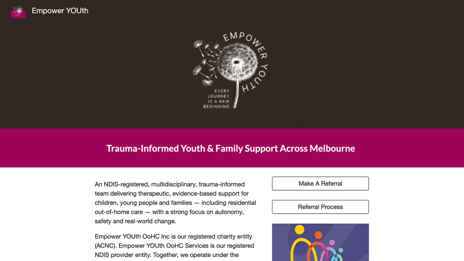
The old website led with registrations, credentials and service terminology before clearly explaining what Empower YOUth actually helps people with.
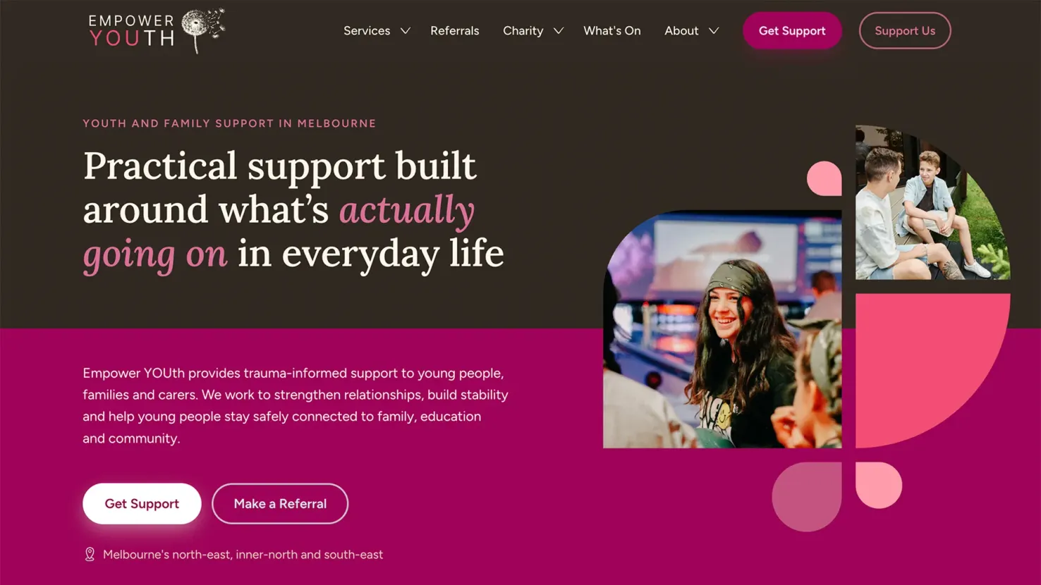
We reversed that order. The new site starts with the situations people recognise, then introduces programmes, NDIS information and service detail when they need it.
Someone can arrive knowing nothing about Empower YOUth, or the language of the sector, and still work out what it does and whether it might be able to help.
02
A clear way in for each audience
Empower YOUth serves people looking for support, professionals making referrals and people who want to support its charity. Each arrives with different questions.
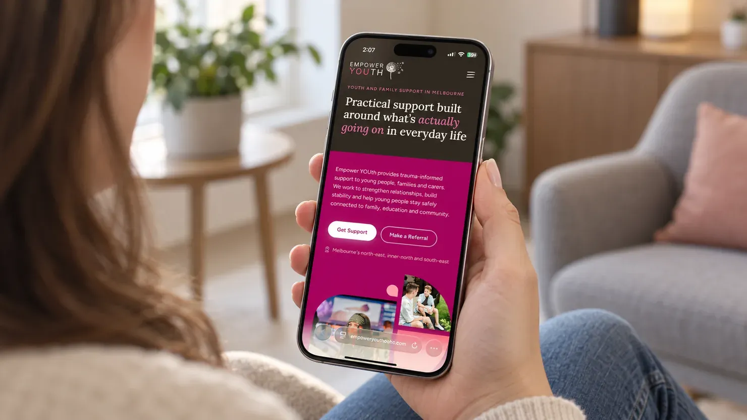
The home page gives each group its own starting point, so people don’t have to work out which services or pages apply to them. The same structure works on mobile.
03
A visual language the team can keep using
The visual identity needed to keep working as the team added new pages. We turned it into reusable building blocks in WordPress.
Highlighted words, hand-drawn icons, dandelion elements, illustrations and flexible photo layouts can all be added by the team without manually recreating the design.
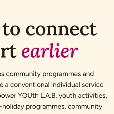
Highlighted words
Wrap a word in asterisks and it’s picked out in the accent colour.
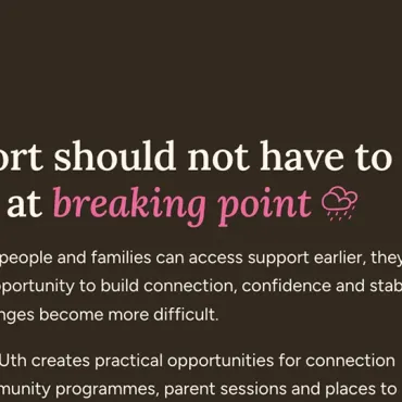
Doodle icons
Type an emoji into a heading or button and a hand-drawn icon appears instead.

Seeds and watermark
The logo’s dandelion seeds, or the dandelion itself as a watermark, on any section.

Illustrations that recolour
Drawings and icons change colour to suit whichever background they’re on.
 1 photo
 2 photos
 3 photos
04
Content that only needs to be entered once
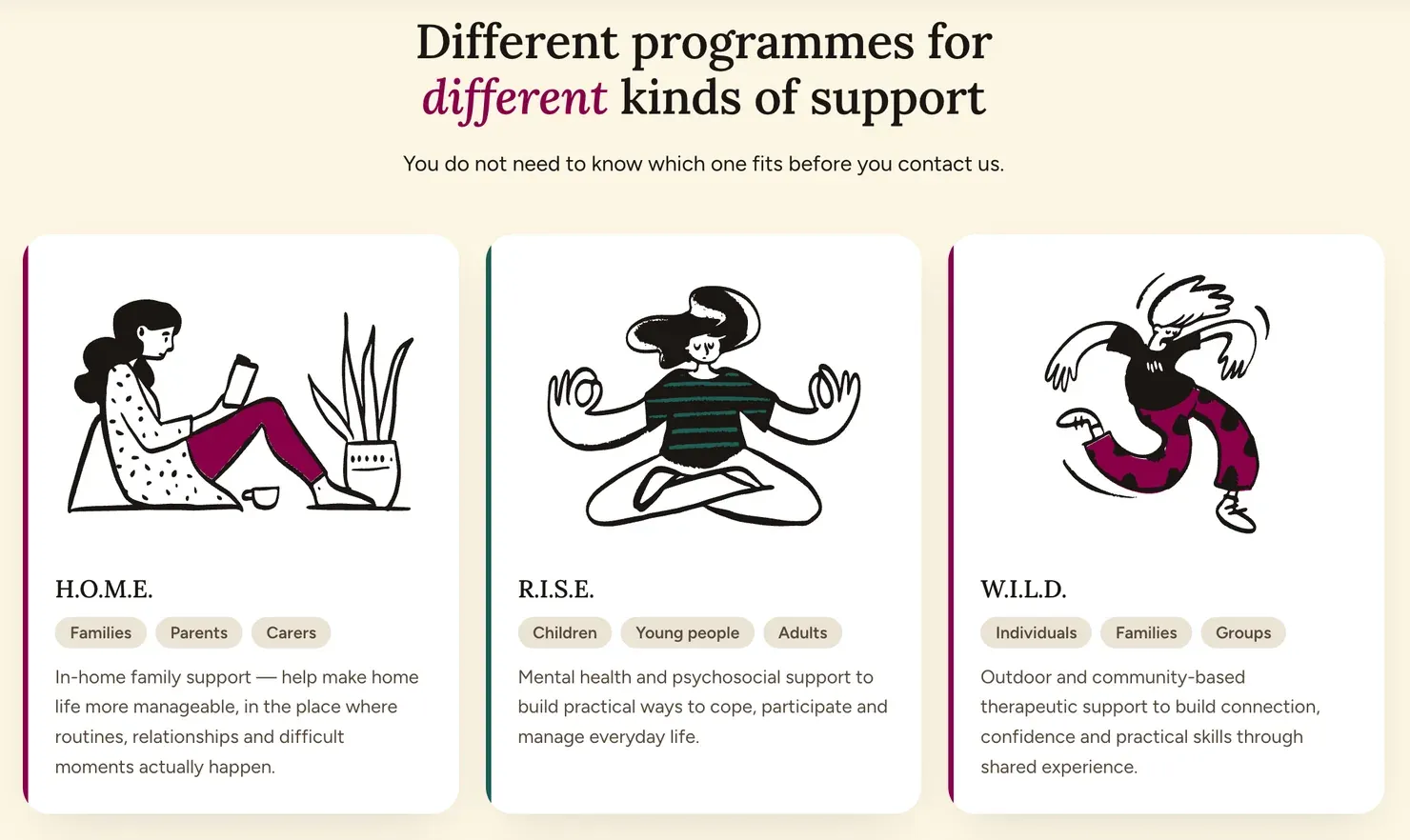
Programmes, team members and resources each have their own structure, so the team enters the information once and it can be reused wherever it’s needed.
Connect a team member to a programme, for example, and that relationship is reflected wherever it is relevant. Programmes and people can also be shown as cards throughout the site without rebuilding the same content.
Resources, including downloads, videos and books, can grow into a useful library without creating one-off layouts each time.
05
Events without double-handling
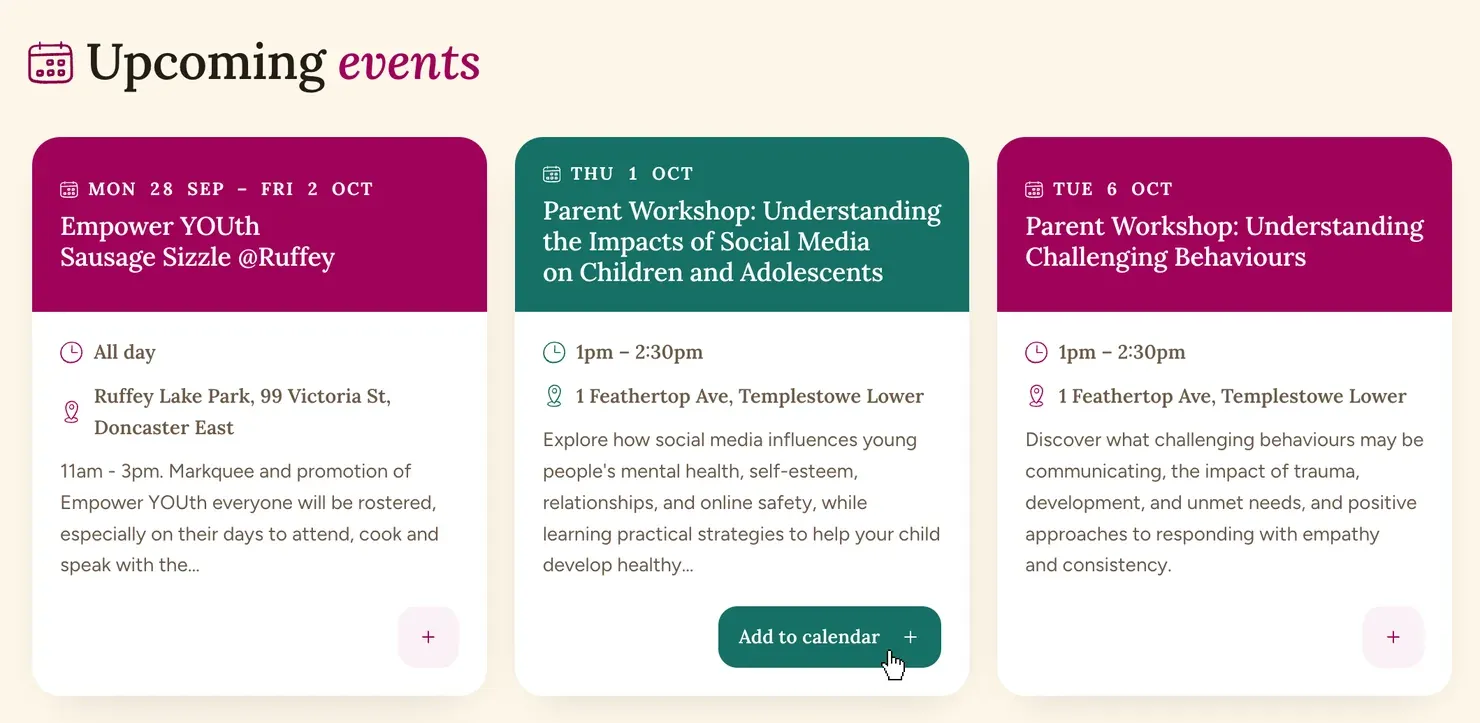
The team was already using Google Calendar, so there was no reason to make them maintain a second calendar in WordPress.
An event added there appears automatically on the events page and relevant programme pages. Visitors can add it to their own calendar.
Enquiries that reach the right person
Each form asks for the information the team actually needs and routes the enquiry directly to the right person.
Support enquiries and referrals can go to different people instead of landing in a shared inbox for someone to sort out.

06
The finished site is clearer for visitors and easier for the team to maintain
The finished website brings Empower YOUth’s services, programmes, referrals, resources, events and charity work into one place.
People can work out where to start and what to do next without first understanding how the organisation is structured internally.
Behind the scenes, the team can add programmes, people, resources and events without rebuilding the design each time.

Thinking about a website your team can actually run?
For Empower YOUth, that meant making the site clearer for visitors without making it harder for the team to look after.
Start a project with us